The combination of printed designs on metallized papers: opaque whites
In our tech tip Tuesday this week, we're exploring the combination of printed designs on metallized papers elevates packaging and labels to their full potential.
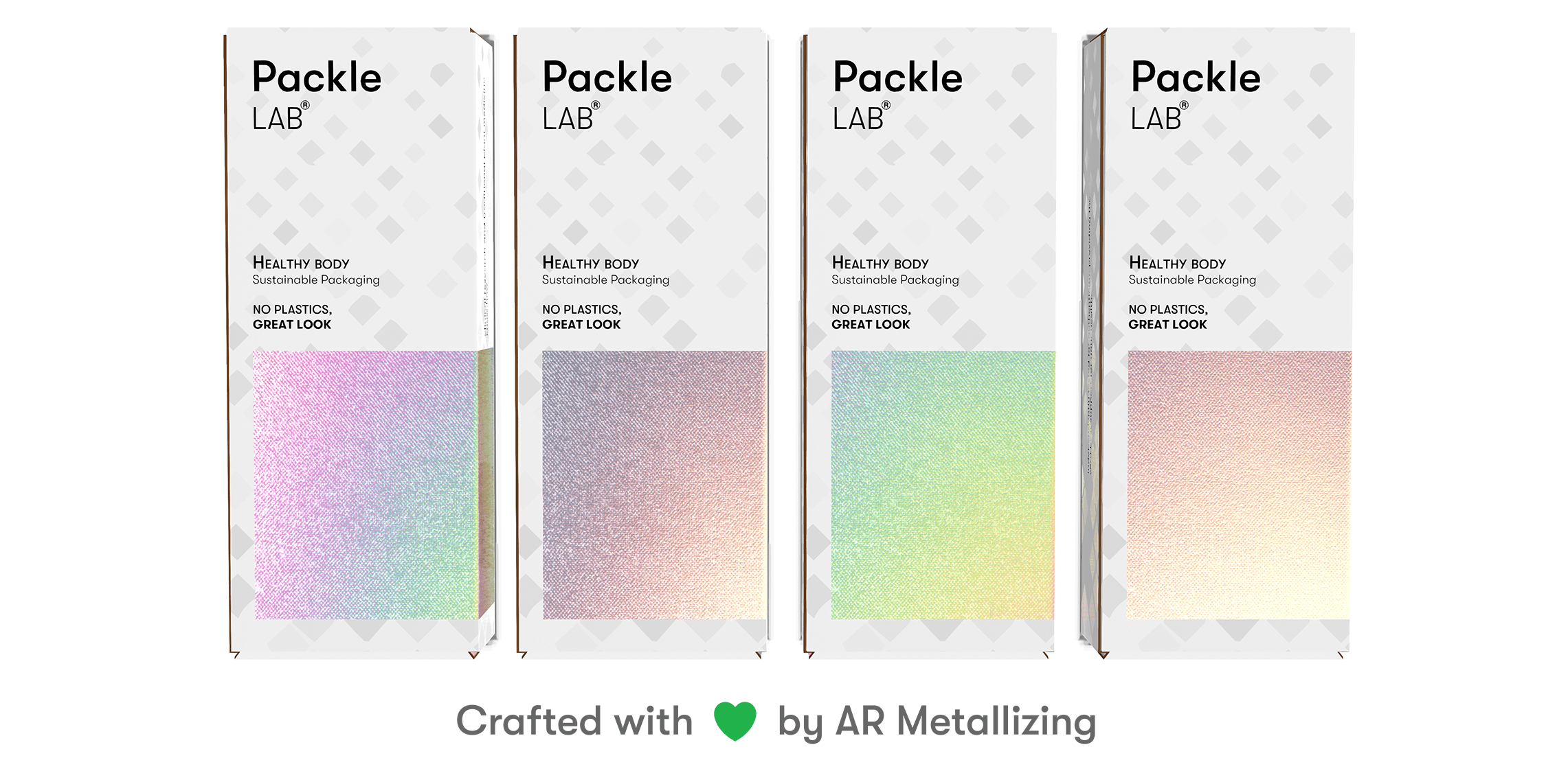
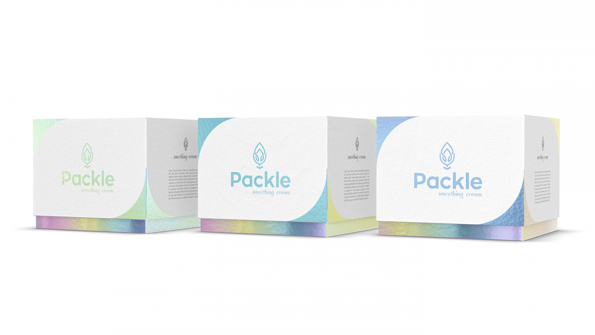
Every design lends itself to many variations of the 4-color CMYK process with opaque white ink and when using in combination with metallized or holographic papers it’s important to explore possible ink screens and/or the full show through of the metallized product underneath. Using standard CMYK with no opaque white ink on metallized papers will offer a solid, bold appearance to printed imagery. Often giving the colors jewel like appearances like emerald, ruby, sapphire, and gold to name a few. This really gives the design a really eye-catching look the consumer would want to pick up and explore more.
Using opaque white ink
Using opaque white ink alone or under a color presents very different results: opaque white ink coverage at a lower screen (10%, for example) will allow the metallized paper to shine, presenting eye-catching looks. Higher percentages of opaque white ink screens give the metallized paper more coverage, presenting more muted, subtle looks and less show through of the metallized underneath.
If the desired result is no metal show through in specific area of the design than a 100% screen of opaque white should be applied prior to the CMYK colors on top. This will ensure the desired image and look needed while still utilizing metal show through in other areas of your design.
Using 100% opaque white creates a pristine, bold and solid white surface as required.
Using a variation of white inks underneath your CMYK can change how your design looks. It all depends what look you are trying to achieve in your design that will determine how much opaque white ink you want to use. We recommend experimenting with a gradient of white ink or adding different percentages of opaque white ink to see how different your design can look. In the end, this will help you hone in on the perfect opaque white ink layer to perfectly compliment your design.