How does colour impact food packaging design?
In theory, the job of food packaging is to protect its contents, prolong shelf life, preserve freshness and ensure that products taste as good as they look. However, food and beverage companies are well aware that packaging plays an important role in how potential buyers perceive the product inside - and how likely they are to buy it. For example, it has been proven that consumers are more likely to stop in front of a product that comes in shiny, glossy packaging.
Colour also plays an important role in shelf appeal. According to recent research, it might even be the most important cue when it comes to product packaging. Colour can be used to convey an idea of a product’s flavour or texture - candy or chewing gum with a sharp, minty taste will often be packaged in green or cool blue, for example. When it comes to products with rich, spicy aromas, such as coffee, these are often indicated through warmer tones, such as browns and deep reds.
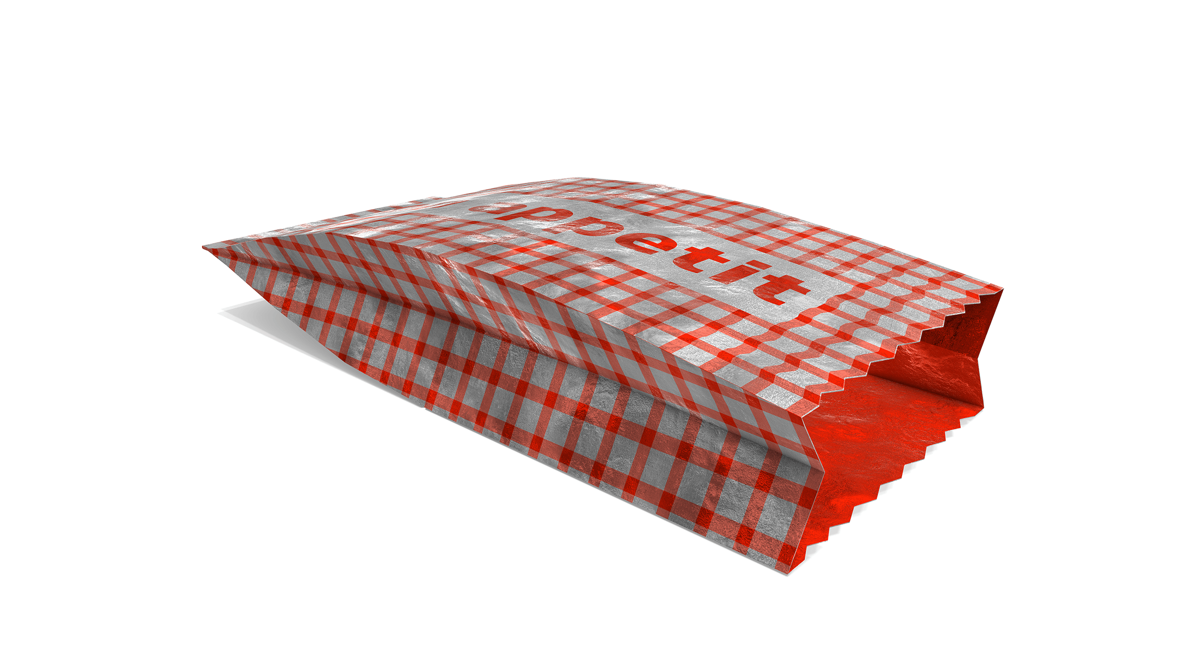
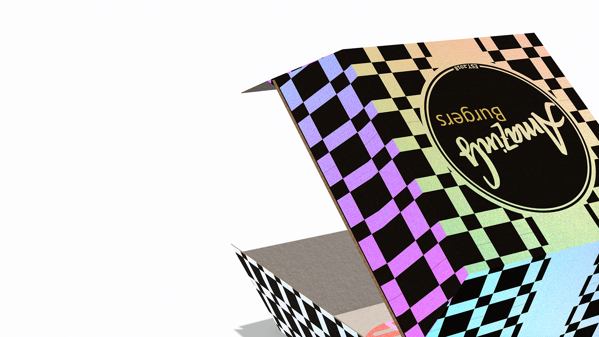
We offer a range of metallized paper-based food packaging options, which can be printed with conventional inks to create different hues and opacity levels for a unique look. Get in touch with our team to find out more.