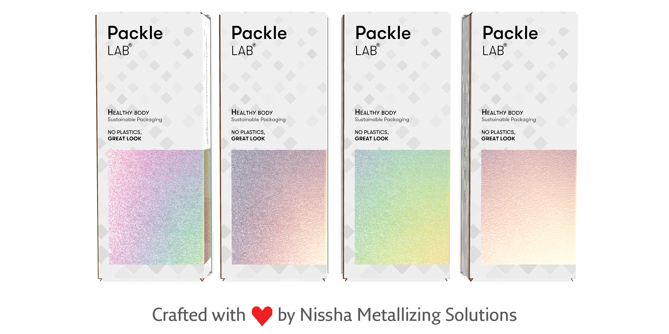
Minimalist vs. maximalist packaging: which is right for your brand?
When done right, minimalism and maximalism are both eye-catching - but in very different ways. While the former stands out on crowded shelves through its spareness and simplicity, the latter relies on bold designs and ornate textures to draw attention. Which is best for your packaging? The answer really depends on the story you want to tell.
Minimalism is a very modern look that relies on clean lines, muted colours and clear, focused messaging. It’s often associated with a sense of innovation and for this reason is a favourite of the pharmaceutical and tech industries - a famous example is Apple’s matte white box.

Maximalism, on the other hand, integrates multiple, sometimes clashing, design elements that are full of movement. Maximalist packaging design is all about luxury and extravagance, which is why it’s becoming increasingly widespread in the premium food and beverage space.
Whether you go for quiet elegance or unapologetic opulence, Nissha Metallizing Solutions’ papers can help create a unique look for your brand, with extensive design flexibility and compatibility with most conventional inks, print methods and machinery.