Why packaging needs to taste good
There’s a reason why the dishes served in Michelin-starred restaurants are so beautifully presented: a strong link between what food looks like and how good it tastes. Scientists have long suspected that what we perceive as “flavour” is actually filtered through our other senses, such as smell, sound, touch and notably sight.
What does this mean for food and beverage manufacturers? According to research, green and yellow are generally associated with sour notes, red, pink and orange are perceived as sweet, white and blue as salty and finally violet, black and brown as bitter. However, consumer perception can change according to the product category: people expect candies wrapped in green packaging to be mint-flavoured, but beverages to be citrus-flavoured. strong impact not only on quality perception, but also on actual taste. Our extensive range of food grade packaging products are based on 100% recyclable metallized paper that can be printed with conventional inks for bold tones and maximum design flexibility.
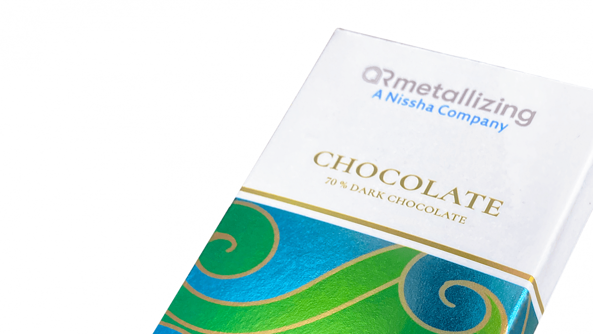
Beyond actual flavour, colours can also be used to convey messages about food healthiness and quality. Organic food manufacturers often go for muted, understated colours that evoke the natural world, such as greens and browns, with simple, elegant packaging. Premium products such as chocolate are often packaged in luxurious gold and silver with holographic effects.
In a nutshell, the way food is packaged has a strong impact not only on quality perception, but also on actual taste. Our extensive range of food grade packaging products are based on 100% recyclable metallized paper that can be printed with conventional inks for bold tones and maximum design flexibility.